§ 1 · The Concept
A broadsheet that behaves like paper
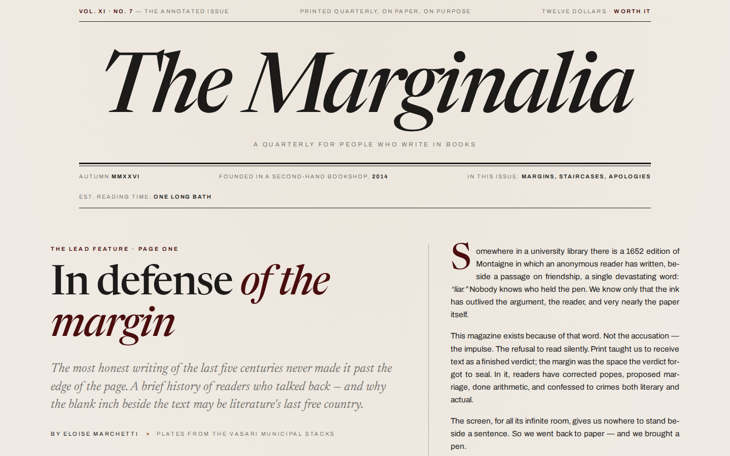
The brief: The Marginalia, a print-revival magazine. Genre — editorial broadsheet. Palette — ecru #EFEAE3, oxblood #4A0E0E, ink #1C1B1A, brass #B08D57, and nothing else. Fonts — Newsreader (display, italic) and Archivo (body, captions). Mood — literate, timeless.
The design thesis is that the web borrowed the magazine's content but abandoned its craft. So every device here is a real print device: a masthead with double rules, folios and page numbers, column rules, justified and hyphenated body text, drop caps, a “continued on page fourteen” jump, and — the signature — footnote superscripts that light up handwritten-feeling notes in a true margin column.
§ 2 · The Technique Stack
Print devices, translated to CSS
No frameworks, no build step — one HTML file per route, one stylesheet, one vanilla script. The main methods:
True magazine grid. CSS multicol (column-count:2; column-rule:1px solid) for the essay, a CSS grid for the plate spread, justified text with hyphens:auto, and drop caps via ::first-letter.
Hover footnotes. The signature trick. Each superscript is matched to a note in an absolutely-positioned margin rail; JavaScript measures the superscript's position with getBoundingClientRect() and pins the note beside its own sentence, collision-stacking notes so they never overlap:
// pin each margin note beside its superscript
document.querySelectorAll('sup.fn').forEach(sup => {
  const note = document.getElementById('note-' + sup.dataset.fn);
  let top = sup.getBoundingClientRect().top - railRect.top;
  top = Math.max(top, lastBottom + pad);  // no overlaps
  note.style.top = top + 'px';
  lastBottom = top + note.offsetHeight;
});
Slow underline draws. Headlines carry a background-image gradient sized 0% 1.5px; an IntersectionObserver adds .in-view and a 1.4s cubic-bezier transition draws the brass rule under the words, like a pen finishing a line.
The “continued on” conceit. The lead feature genuinely breaks mid-argument and jumps to “page fourteen” — an anchor deeper in the document that resumes with “Continued from page one.”
Reduced motion. One media query pre-draws every underline and disables the reveal transitions.
§ 3 · The Plates
Imagery, developed in prompt
Both photographs were generated with MiniMax image-01, then resized and compressed with ffmpeg to under 120KB each. A faint CSS sepia(.14) filter warms the silver-gelatin greys toward the ecru stock. Example prompt, verbatim:
black and white documentary photograph, vast brutalist
library interior, raw concrete coffered ceiling, towering
bookshelves receding into shadow, a lone reader at a long
wooden table, dramatic shaft of window light, grainy 35mm
film, high contrast, Tri-X 400, editorial magazine
photography  — aspect_ratio 16:9
§ 4 · The Red Pen
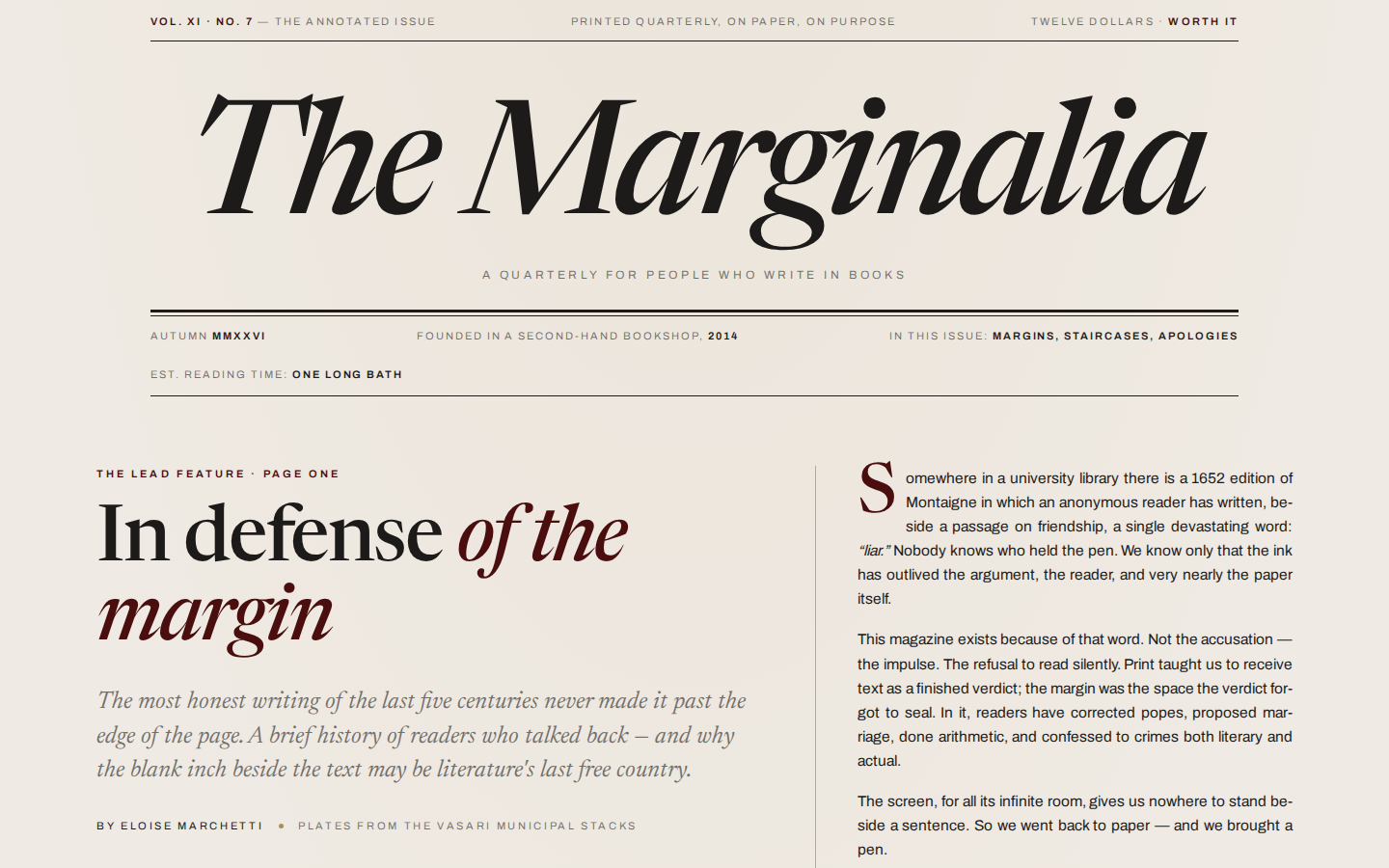
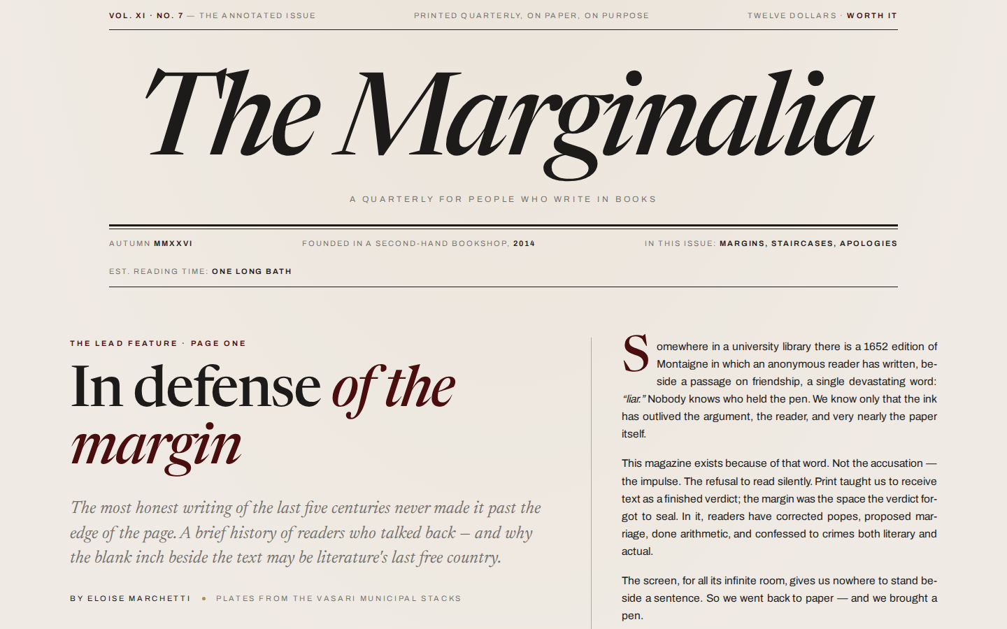
Three proofing passes
Per the FABLE 50 protocol, the live site was screenshotted with Playwright at 1440×900 (plus full-page and 390px mobile), read back, and critiqued like a proof under a loupe — hierarchy, spacing rhythm, palette discipline, whether the margin notes actually land beside their sentences. Each pass produced fixes; each fix was re-deployed and re-shot. The contact sheet below documents the process.